DISCOVERY
Problem:
The client’s concept was innovative and complex and unlike anything currently on the market. The challenge was to craft a tool to watch and edit multiple live-streaming videos, making it user-friendly for non-professional broadcast editors.
Goals:
Create a user experience on par with the leading live streaming gaming services with the added ability to edit live gamers and sporting events and share clips on a user’s channel.


RESEARCH
Live Streaming
I signed up for the top five live-streaming services and began using each application, testing what they could and couldn’t do and noting details regarding performance, user experience and aesthetics.
Broadcast Editors
Owning one editor, I went through the app to refresh my memory of its use. For two of the top most expensive apps, I watch tutorial videos on how the pros use them to understand better how an editor performs specific tasks. My client, who is an ESPN broadcast editor, supplied me with plenty of screenshots of his process.

THE DESIGN PROCESS
Logo:
I elevated the client’s logo, updating the font to Montserrat ExtraBold, removing the dot over the i, and changing its color to a more refined, deeper teal. The K fit nicely into a perfect square, creating a nice icon for social media or a mobile app.


Setting the Mood:
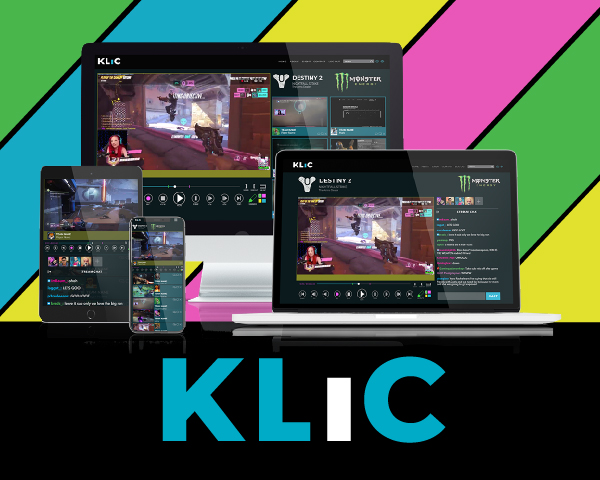
I set the brand’s font set at Montserrat, using ExtraBold for the logo, Montserrat Reg for the body copy and pairing it with Roboto Slab for callouts and quotes. I complimented the brand’s teal color with a rich magenta and bright yellow, all set on a dark background. All colors were used minimally to not compete with the rows of videos a user might be experiencing.
Desktop:
The Desktop layout required working on everything from a gaming monitor to a smart TV. While the addition of TVs created several technical obstacles, the design is responsive and adjusts to whatever size of screen the user has.
Mobile:
The site had to work on phones and tablets for users on the go. We went with a tiny toolbar but added a save-project functionality as well, enabling users to edit and publish in the field or open up their project later on a desktop to finish with the full suite of options.


THE FINAL DESIGN
The project was a great success. The mockups, demos, and pitch deck were all used for the client to secure funding. He is now in development.